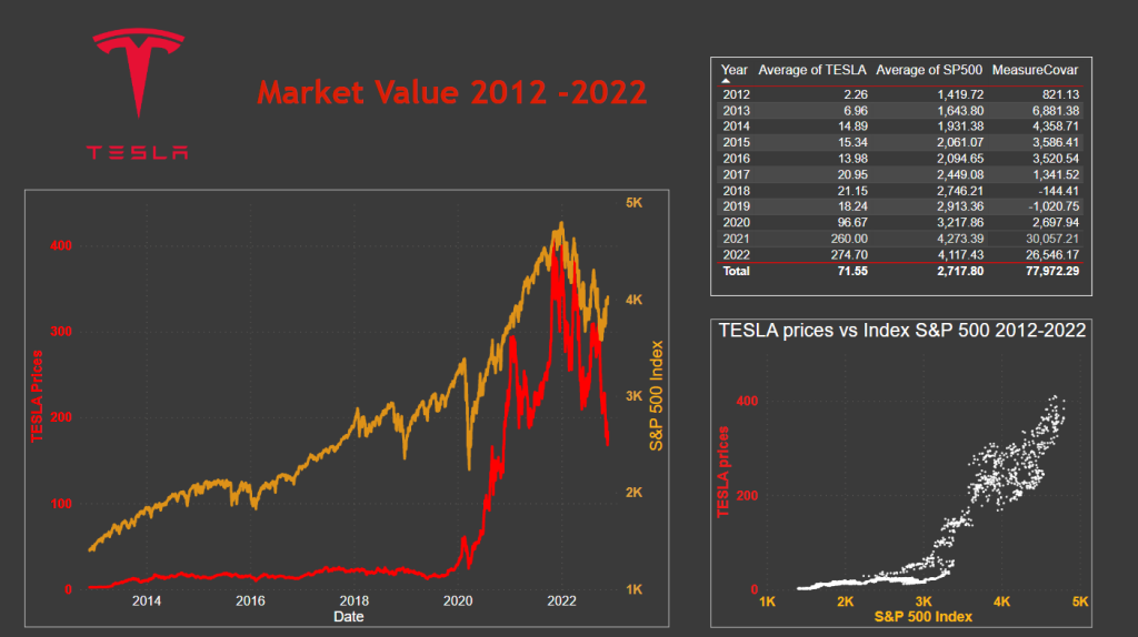
Using Power BI to display TESLA’s value over the past decade.
Note:
To check the dashboard’s functionality, go ahead and:
- hover with your mouse over the different graphs to see relevant values, and then,
- click on different places on the graphs, and you will see the values changing depending on the areas you click on.
- To view it in full screen, press the lower right double arrow.
Case’s background
The visualization presents the historical value of TESLA over the past decade (up to November 2022) and compares it to the S&P 500 Index, which represents the value of the 500 largest capitalization companies listed on US stock exchanges and serves as a good representation of the overall US stock market.
Data
The data for this visualization was obtained from the Yahoo finance website and imported directly. After cleaning and organizing the data, I utilized DAX (Data Analysis Expressions) to perform operations between variables from different tables.
The resulting data visualization clearly illustrates that TESLA began with lower prices and experienced a significant increase, while the S&P 500 has had a gradual growth until the end of 2021.
Line chart

The value of TESLA reached its highest point at the end of 2021 but experienced a sharp decline in 2022.
Table

The table in the upper right corner of the dashboard displays the covariance between the value of TESLA and the S&P 500 Index, which is mostly positive. However, there are exceptions in 2018 and 2019 where the average value of TESLA decreases while the S&P 500 Index increased.
Scatter chart

The lower right graph depicts the rapid growth of TESLA after several years of relatively stable value. The first graph shows a period between 2020 and 2022 where there is a high level of dispersion in points, indicating sudden fluctuations in TESLA’s stock price as well as some fluctuations in the S&P 500.
This was my final project of the Udemy course ‘Power BI: Dashboards Financieros y Análisis Exploratorio‘ by Carlos Martínez.
To learn how to embed Power BI dashboards/reports on your website, visit this post.
Software: Power BI
Difficulty: easy
Databases:
https://finance.yahoo.com/
Category: visualization


