

Visualizing TV series ratings in Tableau
For this visualization, I scraped data with Scraper on this television series website. After saving the data to Google sheets, I cleaned it up and prepared it for analysis. Then, I created a metric that uses the Z-score concept and adds value to the visualization. I exported the data in .csv format and used it in Tableau for visualization.
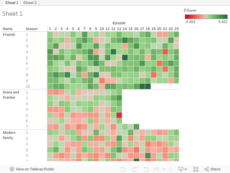
The Z-score is calculated from the mean and the standard deviation of all the average evaluations of all the series studied. Its formula is Z-score = (value – mean)/standard deviation. So, if a value is equal to the mean, the Z-score will be zero, if the value is two standard deviations from the average, its Z-score will be 2. This metric helps visualize the performance of each episode compared to the performance overview of the set of selected series.
It was interesting to see how later seasons of shows tended to have lower z-scores, except for friends who maintained high scores across seasons. And there seems to be a tendency for the z-score to increase as the number of votes increases, but more analysis is needed to see if this is true and to understand why.
This was my final project of the Domestika course ‘Introduction to data visualization‘ by Victor Pascual.

Software: Tableau
Difficulty: easy
Databases:
- Webscrapping from www.ratingraph.com/tv-shows/
Category: visualization